Romantic Art Analysis
Romantic Blog Post: Impressionism vs. Art Nouveau
In this post, I will be discussing
and comparing four different paintings. I will also explain my feelings about
the works and what they represent. Two pieces will be Impressionist works,
specifically, Claude Monet's San Giorgio Maggiore at Dusk and
Vincent van Gogh’s Starry Night on the Rhone. The other two works
will be the Art Nouveau piece Biscuits Lefevre Utile by Alphonse
Mucha and Gustav Klimt's Judith Holding the Severed Head of Holofernes.
After analyzing these four paintings individually, I will conclude by comparing
the Impressionist and Art Neadeau styles and explaining which I prefer.
Impressionism
The 1800s was a time of immense
change and innovation for the arts and the world. The 19th century saw several
short-lived but influential art movements rise and fall. Impressionism was a
trend started in 1874 by a group of like-minded artists known as the Anonymous
Society of Painters, Sculptors, and Printmakers (Samu). The society hosted
eight exhibitions between 1874 and 1886, allowing independent artists to
showcase and sell their work (Gersh-Nesic). This was revolutionary as the only
officially recognized exhibit in Paris was the Salon, which primarily displayed
the work of deceased artists (Gersh-Nesic). Many artists of the society applied
to the Salon several times but were rejected each time due to the new and
unique Impressionist style the artists were trying to showcase. Even after the
success of the society shows, where many of the works were purchased, tabloids
criticized the Impressionist style as looking like unfinished sketches covered
in slapped-on paint (Gersh-Nesic). However, more forward-thinking and modern
writers praised the style's unique way of depicting modern life through texture
and color (Samu). Impressionism was all about capturing brief moments in time
and fleeting light. Artists accomplished this by using bright colors applied
with short, unblended, highly-visible brushstrokes to create vague forms and
structures. One of the best examples of this beautiful and sporadic style is
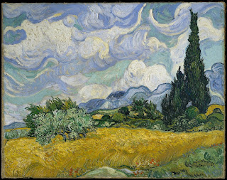
Claude Monet's San Giorgio Maggiore at Dusk.
.jpg)
Claude Monet's San Giorgio Maggiore at Dusk
Claude Monet was one of the
founding members of the Anonymous Society of Painters, Sculptors, and
Printmakers. It was his painting Impression, Sunrise, that earned
the Impressionists their name. San Giorgio Maggiore at Dusk is
a 25.7-inches by 36.4-inches oil painting on canvas created in 1908 while Monet
was visiting Venice at the Hotel Brittania with his wife, Alice (Monet). San
Giorgio Maggiore at Dusk is a perfect example of the Impressionist
style. The vague, hazy shape only hints at a city on the horizon. While I do
not usually enjoy this fuzzy effect, preferring crisp lines on manmade
structures, it works for the late-night haze of this piece. Short and sporadic
brushstrokes of the sky visually blend to create a brilliantly vibrant sunset.
I greatly enjoy the texture this produces in the sky because it is typically
depicted in as smooth and seamless a way as possible. The atmospheres at dawn
and dusk have fascinated and challenged humans for centuries as they attempt to
capture its fleeting lighting and radiance. I too, find vast enjoyment in the
unique lighting and vibrant colors that blaze across the sky at the end of the
day. The fact that San Giorgio Maggiore at Dusk includes an
entire rainbow of colors in its sky, mixed with the hazy lighting, instantly
draws my eye to this almost otherworldly scene. Recently I tried to capture a
picture of the indigo, pink, and light blue sky at nightfall but found the
image lacking the actual colors portrayed. The Impressionists were the first to
truly capture the ephemeral lighting of these minute moments of everyday modern
life.
Although one of his most famous works, Monet almost did not create San Giorgio Maggiore at Dusk. Already sixty-eight when visiting Venice, Monet was reluctant to paint not only because it would be a subject so many other artists had already created renditions of, and his increasingly dwindling eyesight did not further his desire to paint (San Giorgio). For these reasons, Monet created San Giorgio Maggiore at Dusk and several other studies of Venice to be personal reminders of his trip (San Giorgio). Because of Monet's failing vision, Impressionism was the perfect style to attempt to show the world through his imperfect eyes. The Impressionist penchant for blurred shapes and bright colors was likely the best style Monet could complete in his later works. San Giorgio Maggiore at Dusk includes a veritable rainbow in the sky echoed in the water, indicative of Venice. Even the dark shapes of the city are lit with vibrant purples, reds, and even yellow. Despite the sadness Monet was likely feeling due to his ailing body and limited abilities to create, the rainbow theme in this painting strengthens the profound sense of hope I feel when looking at it. Although San Giorgio Maggiore at Dusk portrays a day's end and perhaps the end of a movement, I prefer to think of it as a celebration of the Impressionist movement and the welcoming of a new stage of Monet's life and art as a whole. Monet was not the only Impressionist who utilized the sadness of his life due to sickness to create incredible works of art.

Vincent van Gogh’s Starry Night on the Rhone
Vincent van Gogh is undoubtedly one
of the world's best-known artists who created one of the world's most
recognizable paintings, Starry Night. Completed in September of
1888, Starry Night on the Rhone is a 28.5-inches by 36.2-inches
oil painting on canvas and a precursor to van Gogh's Starry Night in
his night paintings series (Painting). Van Gogh created Starry Night on
the Rhone while staying in Arles, France, in the Yellow House at the
Place Lamartine as a study of the stars in the night sky and their light's
effect on the scenery (Rhone). Although van Gogh created almost 900
paintings, Starry Night on the Rhone was one of the few
paintings displayed in an 1889 Society des Independents exhibition in Paris
before his death (Rhone). Completed not long before his stay in Saint-Remy,
where he created Starry Night, it is clear to see the parallels between
the two paintings. Starry Night on the Rhone is an excellent
example of the Impressionist style. Van Gogh paints using a predominantly cool
blue color pallet with highlights of bright yellow to symbolize the light of
the Rhone's stars and gas lamps. I greatly enjoy this color pallet for the
simple fact that they are two of my favorite colors, and they do not unceremoniously
blend into out-of-place greens. Short textured strokes encompass the entire
canvas, never blending into green but visually merging to create soft shapes.
Painting an area like the Rhone with its modern gas laps is a perfect example
of the contemporary subject matters Impressionists sought to capture. The
staggered lines of the gas lamps' reflection in the water are where one would
expect to find the most activity in the piece, but true to the Impressionist
style, van Gogh uses the texture of the paint to create motion throughout. Van
Gogh's use of impasto (paint applied thickly to the canvas with visible
texture) and varied line directions makes the whole painting feel alive and
full of movement. Although I find that 3D elements being applied to a canvas to
create motion can feel lazy, I believe it works well in this painting. I think
this is because the paint application for Starry Night on the Rhone feels
very planned and intentional in its placement. In criticism of this work, I
will say I find the triangular area that juts out from the bottom of the canvas
a little confusing. I believe it is meant to be a land mass, but I am left
feeling unsure.
Starry Night on the Rhone is
one in a series of night studies van Gogh created in 1888. Craving the challenge
of rendering an area at night, van Gogh used a variety of blues to create
beautiful, luminous, and vivid scenes full of depth despite their dark
settings. I find it especially pleasing how van Gogh used the same yellow for
the stars and the gas lamps, so it appears that the reflections in the water
are not just of the lights but also of the stars above. With the knowledge that
van Gogh would be heading to a mental institute for his severe manic depression
just a few months after the creation of this piece, it is easy to think of the
dominance of blue as a glimpse into his darker thoughts (Wolf). The dark shades
dominating the image cause the small areas of light to stand out even more than
if they were against a lighter space. To me, this shows that despite van Gogh's
feeling that his world was darkening and his depression becoming more
prevalent, he was still fighting to hold on to the bit of hopeful light in his
life. Because of this, I don't view this painting as a sad glimpse into van
Gogh's ailing mental state but as a work demonstrating the artist's will to
keep fighting, living, and creating, despite the darkness enveloping his life.
Another art style that emerged from the Romantic era, which was just as
revolutionary as Impressionism, was Art Nouveau.
Art Nouveau
Art Nouveau is a unique style that
developed during the 1800s. Long, elegant curving lines, organic shapes, earthy
colors, and intricate patterns typically characterize it. The subjects of these
works were usually fantastical women with generally feminine designs influenced
by the emerging feminine ideals of the century (Features). Regarding
architecture, particularly Art Nouveau, the flowing organic forms and
asymmetrical designs were created in direct opposition to the mechanical
uniformity of previous ages (Features). Another common trait of Art Nouveau was
its mixture of materials in architecture and jewelry, combining stone, wood,
metal, glass, and concrete to create nature-inspired designs (Features). With
nature as the driving force behind their designs, it is only natural that
artists of Art Nouveau would also derive their color pallets from the earth.
This meant muted greens and browns were the standard dominant colors in works
accented and highlighted by deep jewel tones of indigo, red, yellow, and purple
(Features). One of the most revolutionary advancements brought on by Art
Nouveau was graphic arts projection into a respected and legitimate art style.
Previously, promotional art was considered low-grade and not worth much
consideration. This perception changed due to Art Nouveau's style and the art
of Alphonse Mucha.

Alphonse Mucha’s Biscuits Lefevre Utile
Earning a place as a respected
artist with many other works, Mucha first gained notoriety by creating a
theater poster for Gismonda in 1894 (Alphonse). Biscuits Lefevre Utile by
Alphonse Mucha is a 23.88-inches by 17.06-inches lithograph print ("Biscuits
Lefevre Utile" [Christopher-Clark Fine Art]). Biscuits Lefevre
Utile was commissioned from Mucha in 1896 while he lived in Paris by
the French Nantes-based biscuit manufacturer Lefèvre-Utile (Poster).
Lefèvre-Utile hired Mucha and several other well-respected artists to handle
their publicity. This poster aimed to showcase their products as high-class
food for privileged persons to enjoy (Poster). Although Biscuits
Lefevre Utile was created simply as an ad, there is hardly anything
simple about this work. The print features a beautiful, fantastical woman
draped in long, flowing clothes reminiscent of ancient Greek robes. As someone
who grew up reading and watching fantasy tales, I am strongly drawn to such
themes because I find them familiar. On the woman’s garment is an intricate
pattern incorporating wheat and sickle motifs appropriate for the product. The
curves of this sickle pattern are echoed in the flowing and organic vine-like
gold line, which wraps gently behind and in front of the woman, creating
elegant and simple depth in the image. I find using this single line to create
such depth in the image extremely clever and pleasing to the eye. It is these
types of adept utilizations that make graphic design so interesting and
attractive. Muted off-whites and maroons dominate the scene, with the bright,
warm yellow of the woman's hair floating around the image in an unnaturally
magical way. For me, this contrast between the dull dominants and vivid accent
colors extremely appealing. The warm gold of her hair is further accentuated by
the bright red poppies crowning her head and the graphic black line which runs
the perimeter of her entire body.
This type of bold graphic lines and
style was the forerunner for the eccentric and respected graphic design we
enjoy now. Today, primarily due to the beautiful work of artists such as Mucha,
we place much more value on advertisements as a form of art. The magical
fantasy women featured in Biscuits Lefevre Utile and many of
Mucha's other works remind me of classic high fantasy movies such as Labyrinth and The
Last Unicorn. The light, flowing animation of The Last Unicorn clearly
links to Mucha's whimsical style, especially in the seemingly free-floating
hair of the characters. Labyrinth is a film dominated by the
typical Art Nouveau color pallet. It is in the film's ballroom scene where one
can most clearly see Mucha's stylistic influence in the costume design of the
characters. Shimmering fabrics are paired with vine-like wire accents, which
combine to create beautiful, flowing designs. I was raised watching these types
of movies that have had significant influences in their own right.
Consequently, I have always loved the colors, themes, and flowing designs of
such films and was thus immediately enraptured by the Art Nouveau look and
especially Mucha's style. Specifically, this work elicits feelings of nostalgia
for my childhood in me. Mucha's work, whether intentionally or not, has
continued to influence the art world well into the 21st century.
Despite being a poster for
biscuits, Biscuits Lefevre Utile exhibits a range of emotions
in her posture and expression. I adore the lighthearted joy the woman in Biscuits
Lefevre Utile exudes. It is made all the more interesting when paired
with the, in my opinion, mischievous smirk on her face and the sultry lean in
her posture. Biscuits Lefevre Utile was not intended to be a
revolutionary piece of art that held an intense, more profound meaning, but it
did in its own way. To me, Biscuits Lefevre Utile symbolizes
two main things. Firstly, it represents the further growing respect for artists
and their abilities that started in the Baroque period. Secondly, modern
feminism was on the rise for the first time during the Romantic period; women
questioned rules and sought ways to earn an income. Although it was likely not
intended as such, to me, the woman in Biscuits Lefevre Utile represents
a new modern woman free to provide for herself, who was not ashamed of her
femininity, or perceived lack thereof, for doing so. A more outright feminist
piece of Art Nouveau was Judith and the Head of Holofernes by
Gustav Klimt.

Gustav Klimt's Judith Holding the Severed Head of
Holofernes
Judith and Holofernes are common
subjects for paintings, with at least 141 known renditions of the pair in
existence (Lopez). The tale of the beautiful Jewish widow who risked her life
and virtue to bravely incapacitate an invading general and behead him with his
sword to save her city has captured artists' interest for centuries. Gustav
Klimt's first rendition of the pair is different from most other versions because
it depicts Judith holding the severed head of Holofernes instead of the act
itself. A 33-inches-by-17-inches oil painting on canvas, Judith and the
Head of Holofernes is surrounded by an intricately decorated gold
frame created by Klimt's brother, George (Lopez). Klimt likely created this
painting while staying at Attersee Lake in Austria (Gustav). Completed in
1901, Judith and the Head of Holofernes was Klimt's opening
work for his 'gold period' at the 8th International Art exhibition in Munich
(Lopez). A short time after, the painting was purchased by Swiss artist
Ferdinand Hodler (Judith). The model for Judith was Adele Bloch-Bauer, who
Klimt chose for her dark hair and striking angular beauty (Judith). Until this
point, Judith had been depicted as a pure embodiment of feminine rage. In a
different direction, Klimt showcased Judith in a more sensual, powerful femme
fatale light. Half-lidded eyes hold a triumphant look that gazes down at the
viewer, increasing the might of her stance. Judith and the Head of
Holofernes uses the typical earth and jewel-toned color pallet and swirling
nature-inspired accents of the Art Nouveau. I feel that this color pallet is
perfect for depicting Judith because her relatively neutral, pale skin and dark
hair are excellently contrasted and highlighted by the deep indigo of her robe.
The vast amounts of gold leaf used in the painting are unique to Klimt. A wide
gold choker, popular during the time in Vienna, adorns Judith's neck. The gold
leaf of the choker almost merges with the background, somewhat severing the
head of Judith along with Holofernes.
Despite not being as graphic as
other depictions of Judith and Holofernes, I find Judith and the Head
of Holofernes still holds tremendous agency and feminine power. With
the rising feminist movement, the question of whether women, with their desire
to gain more from and in life, were trying to become like men was often used
against feminists. To me, Judith and the Head of Holofernes, in
response to this, shows a powerful woman capable of extraordinary heroism,
making it extremely clear she is still an undeniably feminine woman. Even the
cropped head of Holofernes adds to this feeling of feminine might by having
Judith entirely centered as the focal point of the painting. This makes it
clear that the man's head is an accessory to Judith in this situation rather
than the woman serving as an accouterment for the man. In the painting, Judith
is undoubtedly depicted far more sensually than had previously been done. This
does not take away from the rage, power, bravery, and triumph this painting
exudes, but, in my opinion, significantly adds to it. Unquestionably, Klimt was
able to powerfully convey in his work that a woman can encompass these traits
typically associated with men in artwork while remaining undeniably sensual and
feminine. I feel empowered by this painting and grateful to Klimt, who took a
stand and, likely, helped advance women’s rights to the level that women enjoy
today.
Impressionism vs Art Nouveau
Impressionism and Art Nouveau were
both incredibly revolutionary styles of the Romantic era, whose effects are
still felt today. Impressionism is honored to include some of history's
best-known works and artists. It is still more well-respected and may even be
more influential than some Art Nouveau pieces. The unique way in which
Impressionists captured moments of time and the fleeting nature of light utilizing
textured paint application and with such vibrant colors was a breakthrough for
the art world. Despite these facts, I prefer the style of Art Nouveau. The
muted colors of the style paired with the vibrant jewel tones are incredibly
pleasing to the eye and often create ethereal images. Inspired by nature and
surrounded by fantastical swirling motifs, the characters speak to me in a way
that aligns with my personal preferences. Before Art Nouveau, little
consideration was given to graphic design and the actual artistic value of
posters. Thanks to artists like Mucha, with his elegant illustrations and
graphic black outlines, graphic design is now a well-respected career. Art
Nouveau not only greatly influenced posters and paintings with nature themes,
earth tones, and feminist ideals but also clothing, jewelry, and architecture.
It still enraptures people today, influenced countless aspects and mediums of
art, and promoted the modern feminist movement, even if unintentionally. These
are some of the reasons I vastly prefer the style of Art Nouveau over
Impressionism. I feel Impressionism, although very beautiful, has somewhat
limited themes and is a bit too unfocused in rendering its subjects. This is
partially because looking at some of the hazier images makes me feel as if I am
viewing it without my glasses, unable to fully appreciate the work. Although
Impressionism has merit and is valuable in its own right, it does not present a
clear enough interpretation of reality for my liking. I acknowledge the extreme
skills of the Impressionism artists but am not as inspired by their pieces in
my daily life or artwork as I am by the undeniably influential style of the Art
Nouveau artists.
Work Cited
“Alphonse Mucha,”
The Art Story, https://www.theartstory.org/artist/mucha-alphonse/#:~:
text=Mucha%20shot%20to%20fame%20in,as%20costumes%20and%20stage%20sets. Accessed
24 March 2023.
"Art
Nouveau". Encyclopedia Britannica, 19 Oct. 2022, https://www.britannica.com/art/Art-Nouveau.
Accessed 24 March 2023.
“Biscuits Lefevre Utile,” Christopher-Clark Fine Art,
https://clarkfineart.com/artists/la-belle-epoque/alphonse-mucha/biscuits-lefevre-utile/.
Accessed 14, March 2023.
“Biscuits Lefevre Utile,” TheHistoryOfArt.org, https://www.thehistoryofart.org/alphonse-mucha/biscuits-lefevre-utile/.
Accessed 14, March 2023.
“The Defining Features of Art Nouveau Design and
Architecture,” DK Studio Architecture, http://www.studiodk.com/blog//history-of-art-nouveau-architecture.
Accessed 24 March 2023.
Gersh-Nesic, Beth. “A Beginner's Guide
to Impressionism,” Khan Academy, https://www.khanacademy.org/humanities/becoming-modern/avant-garde-france/impressionism/a/a-beginners-guide-to-impressionism.
Accessed 23, March 2023.
“Gustav Klimt,” Wikipedia,
https://en.wikipedia.org/wiki/Gustav_Klimt.
Accessed 27, March 2023.
“Judith and
the Head of Holofernes, 1901 by Gustav Klimt,” Gustav-Klimt.com, https://www.gustav-klimt.com/Judith-and-the-Head-of-Holofernes.jsp.
Accessed 25 March 2023.
Lopes, Teresa
Filipe. “Gustav Klimt’s Judith and the Head of Holofernes” Art Corner, September
14, 2014. https://www.overstockart.com/blog/judith-and-the-head-of-holofernes/#:~:text=To%20complete%20the%20eccentricity%2C%20Klimt,Baptist%20on%20another%20biblical%20tale.
Accessed 25 March 2023.
“Poster for 'Biscuits
Champagne Lefèvre-Utile',” Mucha Foundation, http://www.muchafoundation.org/en/gallery/browse-works/object/41.
Accessed 24 March 2023.
Samu, Margaret. “Impressionism:
Art and Modernity,” The MET, October 2004. https://www.metmuseum.org/toah/hd/imml/hd_imml.htm.
Accessed 23, March 2023.
“San Giorgio
Maggiore at Dusk, 1908 by Claude Monet,” Claude Monet.com, https://www.claude-monet.com/san-giorgio-maggiore-at-dusk.jsp.
Accessed 23, March 2023.
“San Giorgio
Maggiore at Dusk,” Totally History, https://totallyhistory.com/san-giorgio-maggiore-at-dusk/.
Accessed 23, March 2023.
“Starry Night
Over the Rhône – van Gogh’s Star-Filled Painting,” Art in Context, October
13, 2022. https://artincontext.org/starry-night-over-the-rhone/.
Accessed 23, March 2023.
“The Starry
Night Over The Rhone, 1888 by Vincent Van Gogh,” Vincent van Gogh.org, https://www.vincentvangogh.org/starry-night-over-the-rhone.jsp.
Accessed 23, March 2023.
Wolf, Paul. “Creativity
and Chronic Disease Vincent van Gogh (1853-1890),” National Library of Medicine,
November 2001, https://www.ncbi.nlm.nih.gov/pmc/articles/PMC1071623/
#:~:text=Plagued%20by%20psychiatric%20illness%20throughout,thought%20affects%20many%20creative%20people.
Accessed 14,
March 2023.

Hello Abby! Thank you for sharing your blog and great intro! Your blog was very informational and structured very well. I found the four pieces you chose very striking. They were great examples of the art styles.
ReplyDeleteGreat work on portraying the history of San Giorgio Maggiore at Dusk. I too find the colors of this piece brilliantly vibrant. Knowing the history of this piece, I find it more appealing. I like how the within the reflections there are different textures.
Starry Night on the Rhone has a complimentary color palette. The yellow light reflections in the water draw vertical lines throughout the painting that make it appear balanced.
I am not the biggest fan of Impressionism and prefer most styles over it. Mostly because I like straight lines and detail. Sometimes I look at Impressionism and think “it appears the artist did this work in 5min” or “it looks like finger painting.” However, the two examples you posted do look like a skillful artist created them.
Very thorough explanation of Art Nouveau and the history of Biscuits Lefevre Utile. I enjoy the detail of this piece. You pointed out so many hidden gems, like the black line outlining her body…I did not notice that until I read your description. It’s very interesting to me the history of how advertisement became art and influence graphic design. I see this style and perhaps some of these exact advertisements hanging in citchy cafes or restaurant bathrooms.
The gold in Judith Holding the Severed Head of Holofernes was striking to me. I honestly did not notice the severed head in the bottom right corner until I read the title of the piece. I enjoyed your discussion of the Feminism in both Art Nouveau pieces.
I too prefer Art Nouveau over Impressionism. I feel like you conclusion is verbatim opinions I would say. I thoroughly enjoyed your blog and thought you did a great job explaining the pieces.
I admire the commercial artwork from Art Nouveau; they were the precursors of the graphic design we know today. So Mucha´s designs and influence can be found everywhere, especially since the 7'´s hippy movement made it trendy again (i am so glad they did).
ReplyDeleteCompared to Mucha's beautiful and clean curves, Kilt comes across as a painter with many strait geometry and angles. The lines can be less clear and defined since the medium is entirely different, and he could fill his compositions with detail to the brim (there was no need to catch the eye of the consumer since it was not an ad). That is why the head of holofermes is so out of the frame; it's an accessory, not something that tries to grab your attention like the can of biscuits.